Contact Us
Whether you are ready to get started, or just have questions, we would love to hear from you!
Call us at 704-684-9438
Responsive Website Design is the practice of designing and developing a website so that it fits according to the device being used.
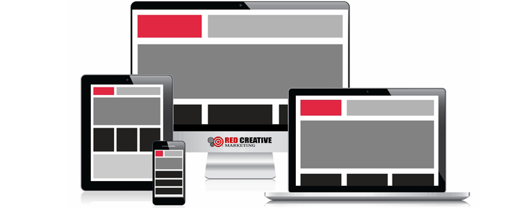
One design for all devices. That’s the idea behind Responsive Web Design. No need for a second website, different content, a variety of logins and management systems… your website and its content shown in a cohesive way no matter how the website is accessed.
Without responsive design, users typically zoom in and out or get a mobile only site with different content. The end result is frustration!
You’ve been there. You visit a website from your computer at home and find some great information. While you are away, you need to access that information for some reason. Maybe you are showing off what you learned to a friend. Perhaps you need to brush up on information before that interview or appointment. Or maybe you just want to re-read that interesting article again. But when you pull the website up on your mobile device, you run into problems. Perhaps you find that the website requires you to constantly zoom and pinch in and out just to find and read the content. Or worse, you are diverted to a “mobile only” website and you can’t even access the same information. The end result is pure frustration!
Now apply this to your website. After all that you have invested in your website, in both time and money, do you really want your users to come away with that feeling of frustration? Is that the last impression you want them to feel in dealing with you and your website?
But not having a website that is responsive to a device’s size, you are frustrating your users. Even worse if you have different content for your mobile users. And with the web becoming more and more mobile, you can’t afford not to provide a great experience to your users!
At Red Creative Marketing, we believe that your website’s content and message should be accessible regardless of the device being used. From a large 32″ monitor to a 4″ handheld smartphone, your message is important. That’s why we work with our clients to provide Responsive Website Design and Development in our projects. We feel it is important that your users always have full access to your content.